

Design illustrato e palette autunnali
Design illustrato e palette autunnali

>>> English text below >>>
Sto trascorrendo questi primi giorni autunnali nel mio laboratorio di stampa, nella campagna canavesana (non troppo distante da Torino) al lavoro su una nuova serigrafia.
L’illustrazione della quale ho scelto di fare una tiratura in serigrafia nasce qualche mese fa, progettata per la copertina di una rivista di design e ispirata alla figura di Gae Aulenti: architetta, intellettuale, designer di fama internazionale, nonché la donna più influente in un'industria dominata all’epoca prevalentemente dagli uomini.
“La tradizione non è qualcosa che si riceve in eredità, ma qualcosa che si costruisce ogni giorno”
Questa frase di Gae Aulenti racchiude in maniera accurata la mia ricerca stilistica e il mio personale approccio al lavoro: da anni porto avanti tecniche tradizionali fondendole di volta in volta con ciò che gli strumenti odierni mi mettono a disposizione, amalgamandole a un’estetica contemporanea, per dare luogo a immagini che a partire dal passato si trasformano in nuovi linguaggi.
Quando ho iniziato a fare serigrafia, durante gli anni dell’università, era fuori discussione farsi realizzare le pellicole da un laboratorio di stampa, perché si trattava di costi poco sostenibili per degli studenti: ho iniziato quindi a dipingere direttamente sugli acetati con l’acrilico nero per evitare questo passaggio. E visto che anche gli acetati avevano un costo, ho iniziato ad andare per tipografie a farmi regalare i vecchi acetati industriali delle pubblicità e a raschiare con il taglierino le immagini stampate sopra. Emergevano dettagli sorprendenti, perché spesso i residui di ciò che erano state conferivano maggiore matericità a ciò che si andava a dipingere sopra: c’erano tutta una serie di “sporchi” vecchi che erano affascinanti mescolati alle parti dipinte ex-novo. E mi faceva sorridere quando le persone vedevano le serigrafie finite e commentavano: “Che belli questi segni, queste texture, come li hai fatti? Con i pennelli di Photoshop?” "No, con le vecchie pubblicità raschiate del supermercato di provincia." Di necessità virtù. Con gli anni poi ho acquisito un metodo di costruzione delle immagini dettato dalle esigenze di stampa, che ho mantenuto però anche quando le immagini non sono state più destinate alla sola serigrafia, ma magari a una copertina di libro o a un manifesto. Si può dire che la serigrafia “old school”, fatta con gli stessi mezzi antiquati e di fortuna con cui venivano realizzate quelle dei manifesti del maggio francese, ha determinato la mia cifra stilistica odierna.
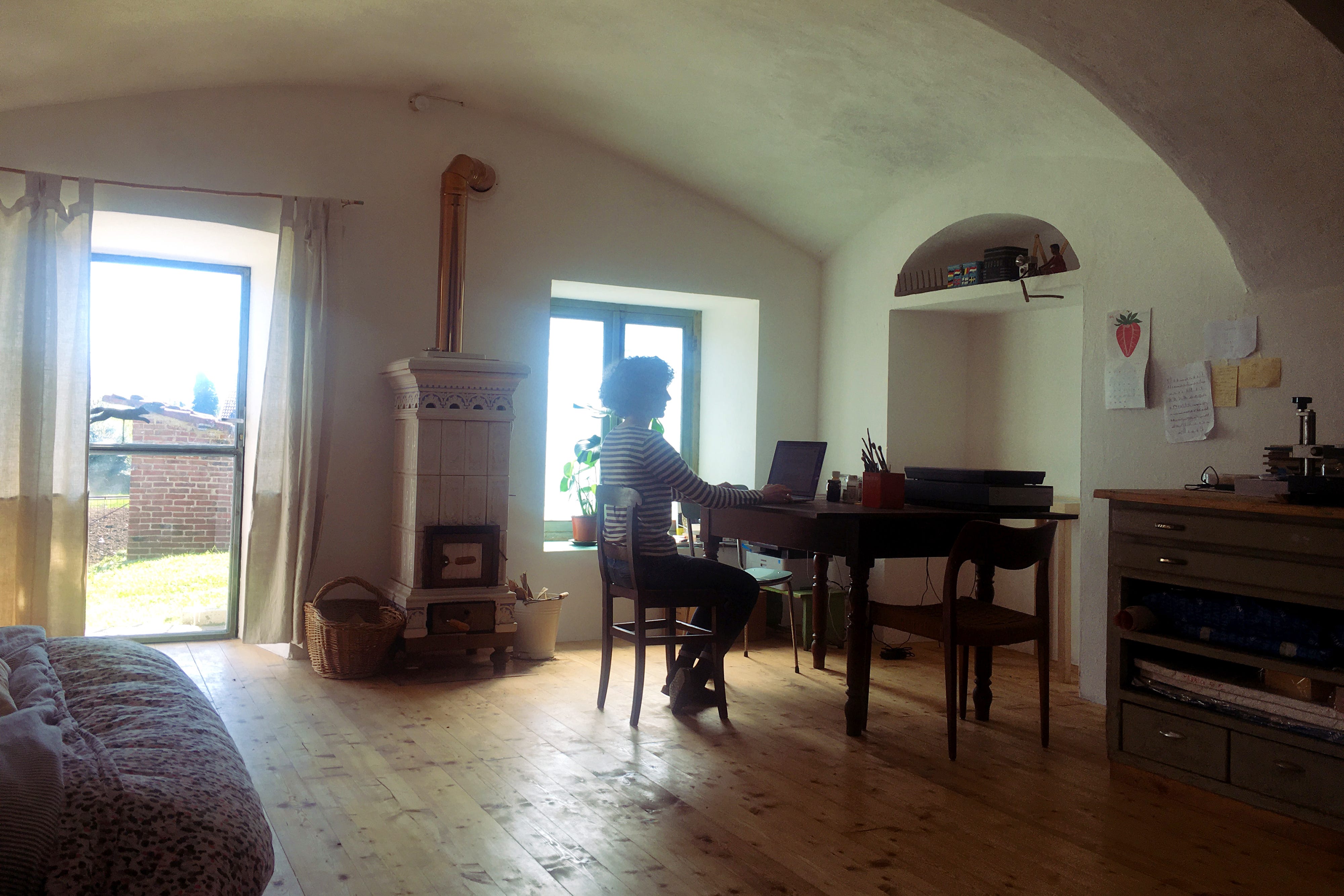
Castellamonte, laboratorio di stampa (*stufa tradizionale del luogo)
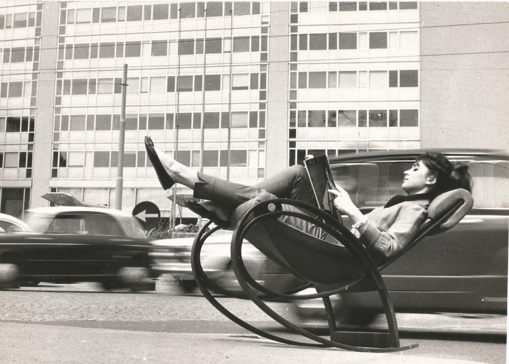
Milano, sedia “Sgarsul”, Gae Aulenti

Palette autunnale nuova serigrafia
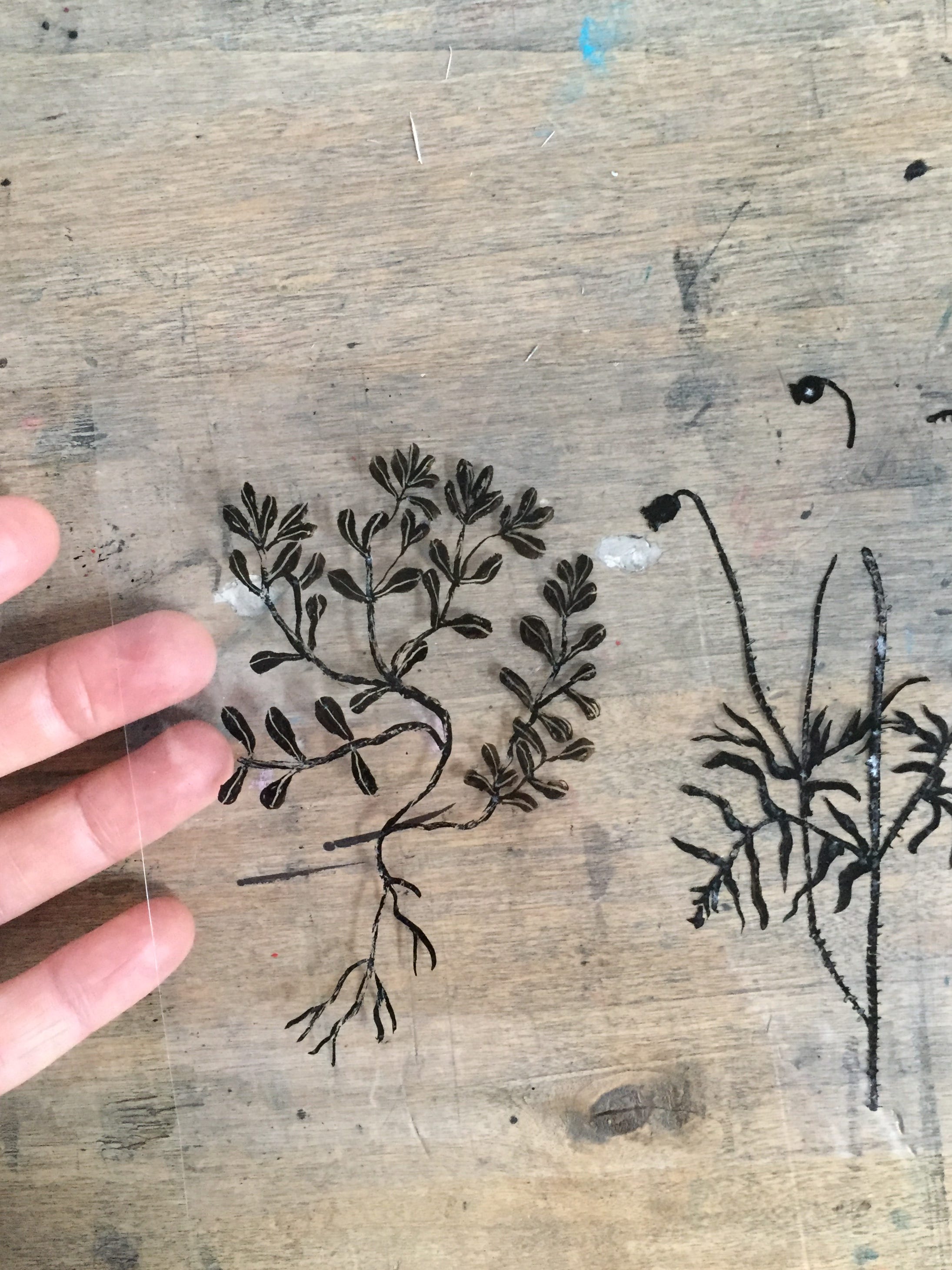
Acetati dipinti a china per serigrafia

“Wild nature”, serigrafia a 14 colori su carta Favini Crush Citrus 350 gr, f.to 50x70 cm
La nuova serigrafia è in lavorazione e sarà pronta entro un paio di settimane.
Da oggi è attiva la prevendita con uno sconto del 20% sull’acquisto entro il 31 ottobre utilizzando il coupon WILDPREORDER sul mio shop
Il coupon dà diritto allo sconto immediato, la stampa verrà poi spedita a partire dal 13 novembre.
>>> English >>>
I am spending these early autumn days in my printing workshop in the Canavese countryside (not too far from Turin) working on a new silkscreen print.
The illustration of which I chose to make a silkscreen print was born a few months ago, designed for the cover of a design magazine and inspired by the figure of Gae Aulenti: architect, intellectual, internationally renowned designer and the most influential woman in an industry dominated at the time mainly by men.
"Tradition is not something you inherit, but something you build every day."
This sentence by Gae Aulenti accurately encapsulates my stylistic research and my personal approach to work: for years I have been carrying on traditional techniques, merging them from time to time with what today's tools put at my disposal, amalgamating them with a contemporary aesthetic, to give rise to images that from the past are transformed into new languages.
When I started screenprinting, during my university years, it was out of the question to have films made by a print shop, because it was an unaffordable cost for students, so I started painting directly on acetates with black acrylic to avoid this step. And since acetates also had a cost, I started going to print shops to get old industrial acetates from advertisements and scraping the images printed on them with a cutter. Amazing details would come out, because often the remnants of what they had been gave more texture to what you were going to paint over, there was a whole series of old "dirt" that was fascinating mixed in with the new painted parts. And it made me smile when people would see the finished silkscreens and comment, "How beautiful are these marks, these textures, how did you do them? With Photoshop brushes?" No, with old scraped advertisements from supermarkets. Over the years then I acquired a method of image construction dictated by printing needs, which I maintained, however, even when the images were no longer intended for screen printing, but perhaps for a book cover or poster. "Old school" silkscreen printing, done with the same old-fashioned and makeshift means with which those of the French ‘68 posters were made, has determined my style today.
The new silkscreen is in the works and will be ready within a couple of weeks.
The pre-sale is now active with a 20 percent discount on the purchase by Oct. 31 using the coupon WILDPREORDER on my shop